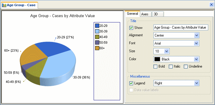
For easier analysis, you can create 2D and 3D charts to visually present your coding or display your matrix query results. For example, you might want to present how your cases are divided into Age Groups:
|
|
You can view project data information by moving your mouse over each element in the chart. You can also double-click on a chart element to open the related source or node in Detail View. When there is not enough space to fully display the chart legend, a partial legend is displayed with the text 'more...' at the bottom. You can make more space for the legend by re-sizing or undocking the Detail View—refer to Customizing the Workspace for more information. |
|
|
|
Using the Chart Wizard, you can generate colorful charts to:
Compare the top 20 nodes used to code a particular source. For example, chart the source Video-Non Volunteers to show the nodes by percentage of coverage. For these nodes, show either the number of references or the number of cases.
Look at the different sources that are coded at a node. For example, chart the node Motivation to see which sources are coded at this node and their corresponding percentage of coverage.
Display cases by attribute value for one or two attributes. For example, chart the attribute Age Group to see which age group (e.g. 30-39) most of your cases belong to.
Show coding by attribute value for a source or a node. For example, chart the node Motivation to show coding by attributes Age Group and Country.
Show coding by attribute value for multiple nodes or sources. For example, chart the nodes Motivation andAspirations about volunteering tasks to show coding by the attribute Age Group.
Visually display matrix query results.
Various chart display types are available in 2D or 3D styles including pie, bar, column, heat map, bubble chart and radar. Refer to What Type of Chart Should I Use? for more information.
Chart formatting options include angle adjustments for 3D charts, color palette for titles and labels, and selecting grid lines to display/hide. Refer to Formatting Charts for details.
|
|
Although you cannot save a generated chart within your project, you can copy it to paste in a memo, create a picture source or export it as an image or PDF. Refer to Copying and Exporting Charts for details. |
|
|
|
![]()
![]()
