There are numerous types of charts you can use to present research data. NVivo helps you make an effective choice by listing only the most relevant types to use for the data you want to chart. In general:
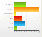
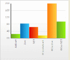
Bar or Column charts are useful when comparing quantity or analyzing an increasing/decreasing trend.
Bar Column
These types of charts can be further displayed as:
3-Axes bar or column chart
Stacked bar or column chart
Grouped bar or column chart
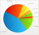
Pie charts effectively show the measure of different parts that make up a whole.
Bubble charts or Heat Maps show varying density of data when comparing combinations of variables or matrices.
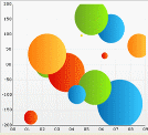
Bubble Heat
Radar charts effectively displays direction or trend when comparing several variables
![]()
![]()